What to Wear to your Studio Session?
First, decide whether you want to go for a lighter, dark, or more neutral look. Then, choose which backdrop you'd like from the choices provided by the photographer. I will need to know what backdrop you are choosing prior to your session. From there, you can decide on your outfits.
Outfit Choices are Important!
But why?
Outfit's help make your photo make sense. It helps to tell the person looking at the photo the story of the setting you were in. Wearing the right outfit will make your photo look more appealing to the eye.
Think of it like this, would you wear a swimsuit in a Holiday photo? Probably not! But you would wear something that includes holiday colors or something that tells the kind of weather we endure during the Holidays. All of this is appropriate and helps the photograph make sense.
What to Wear for Which Backdrop
Cream and Light
Light neutral tone outfits
White or cream is best
Oatmeal, light gray, tan, blush also work well
Best option for sibling photos
Mid- Tone and Medium
Neutral, warm tone outfits
Black or cream is best
Great option for family photos with a warm feel
Gray and Dark
Dark neutral tones or gemtone outfits
Black or dark gray is best
Avoid light colors
Great option for parent/newborn photos
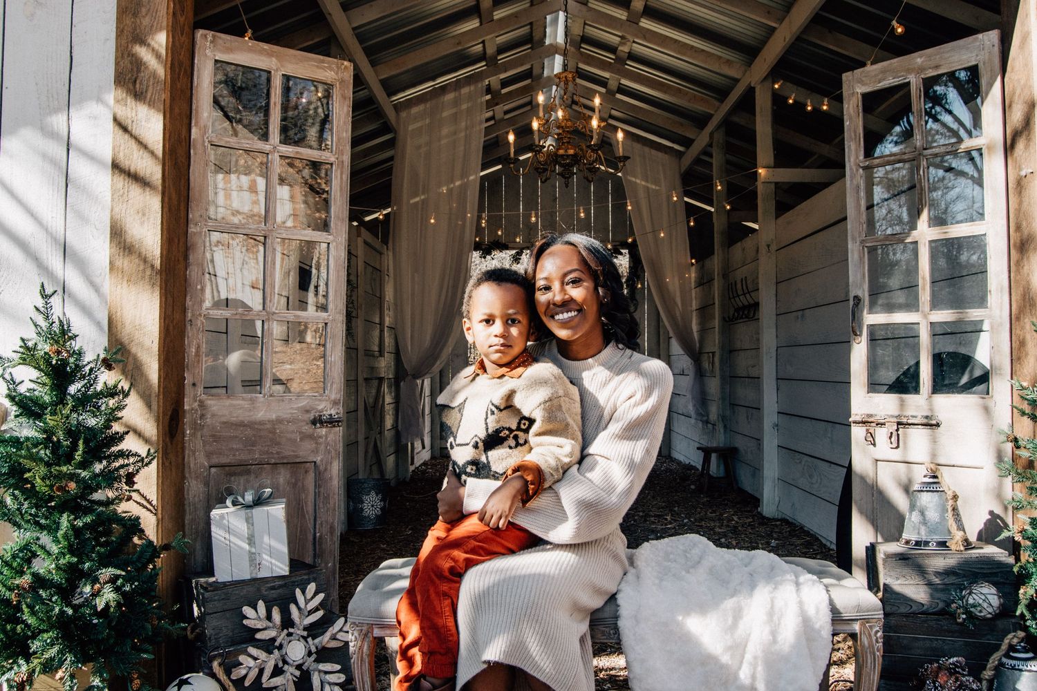
Light Colors
White is a very popular choice for family photography and can look absolutely stunning in images if done correctly. Sometimes off-white, cream, or ivory can soften the image and create a more delicate look. Do be aware that your eye will go to the lightest area in a picture, so white jeans will draw the eye and might make you look larger than you are.
Dark Colors
Black can be a bit dark for family photography so blue or gray would be a better choice as it’s a bit softer. Certainly don’t dress half the family in black and half in white as that will create harsh contrast problems in your images.
Neutrals
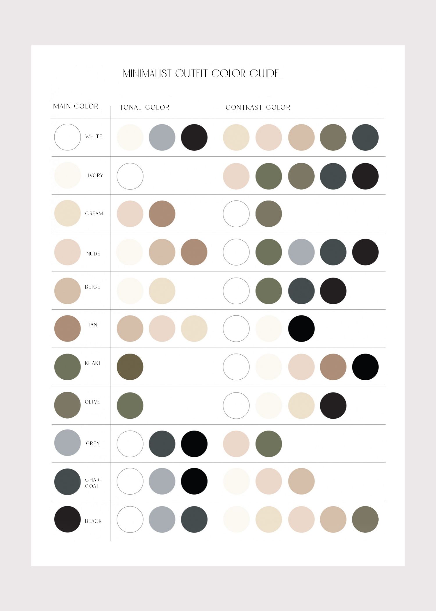
Neutral, coordinating colors. Mix neutral earth tones that go well together but are not exactly the same. Variations and different shades of black, white, ivory, cream, and gray. Some colors have neutral-like characteristics, such as earth tones like sage and olive greens, burnt orange, sand, and shades of blue including navy and denim.
GemStones/ Pastels
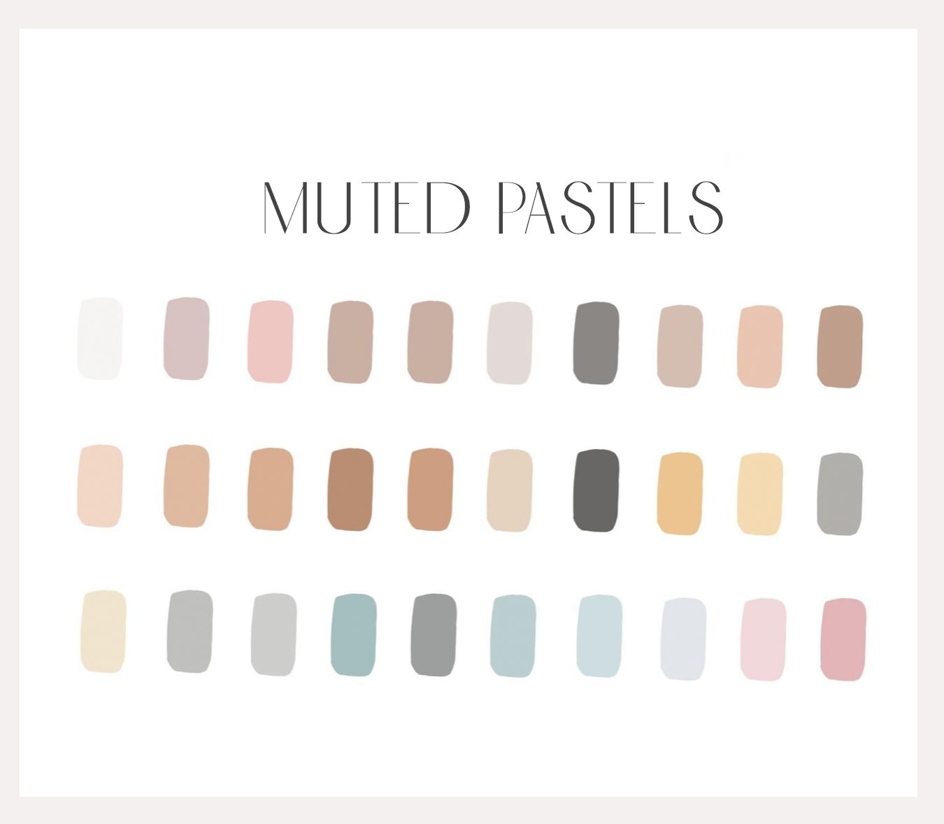
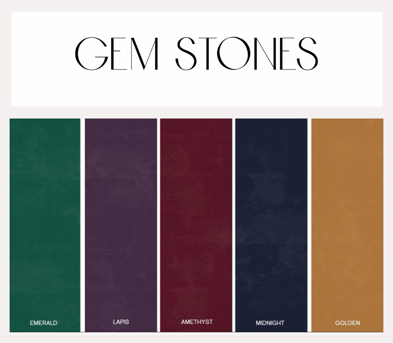
Adding in subtle splashes of pastels or gemtones can also be a great way to bring some color into your photos.
Still Need Help?
I'd be glad to help, just send me an email under my "contact page" and we can discuss other options.